From Pantone's surprising all-white declaration to Dulux's bold pivot to indigo blues and Farrow & Ball's rich new earthy palette — 2026 is a year of meaningful, emotionally considered colour choices. We've analysed every major paint brand's Colour of the Year, UK search data, and consumer research to bring you the most complete guide to this year's colour trends.
The Big Picture: What's Driving 2026 Colour Trends
Colour trends don't emerge in a vacuum. The palette shift we're seeing across UK interiors in 2026 is being driven by a specific set of cultural forces — and understanding those forces helps explain why the same themes keep appearing across brands as different as Dulux and Farrow & Ball, Pantone and Little Greene.
The dominant driver is a collective desire for emotional warmth and grounding. According to furniture brand Sharps, which analysed UK search data alongside original consumer research among 2,001 homeowners in January 2026, earthy tones attracted over 18,000 UK searches per month in 2025 and have seen year-on-year growth of 22%. Chocolate brown interior searches rose by 120% year-on-year. Khaki interiors were up 100%. These are not small fluctuations — they represent a sustained, accelerating shift in taste.
The second driver is a reaction to overstimulation. Pantone's decision to name Cloud Dancer — an off-white — as its 2026 Colour of the Year was explicitly framed as a response to a "frenetic society rediscovering the value of quiet reflection." Lick's palette, titled Return to Play, reaches in a different direction — bold primary-inspired colours reimagined with maturity — but arrives at a similar conclusion: that people want colour to feel emotionally purposeful, not just on-trend.
The third driver is a growing dissatisfaction with the neutrals of the previous decade. Cool grey — the colour that defined British interiors for much of the 2010s — is now widely described as dated by UK interior designers. The warm whites, soft pinks, and earthy tones replacing it are not a radical revolution so much as a recalibration: bringing warmth and character back to rooms that were, in many cases, too cool and too uniform.
This analysis draws on Sharps' 2026 UK Interior Trends Forecast (based on global search data and a Censuswide survey of 2,001 UK homeowners), paint brand Colour of the Year announcements from Dulux, Pantone, Benjamin Moore, Graham & Brown, Little Greene, Lick, and Valspar, plus expert commentary from UK interior designers published across Ideal Home, Homes & Gardens, and Country & Town House.
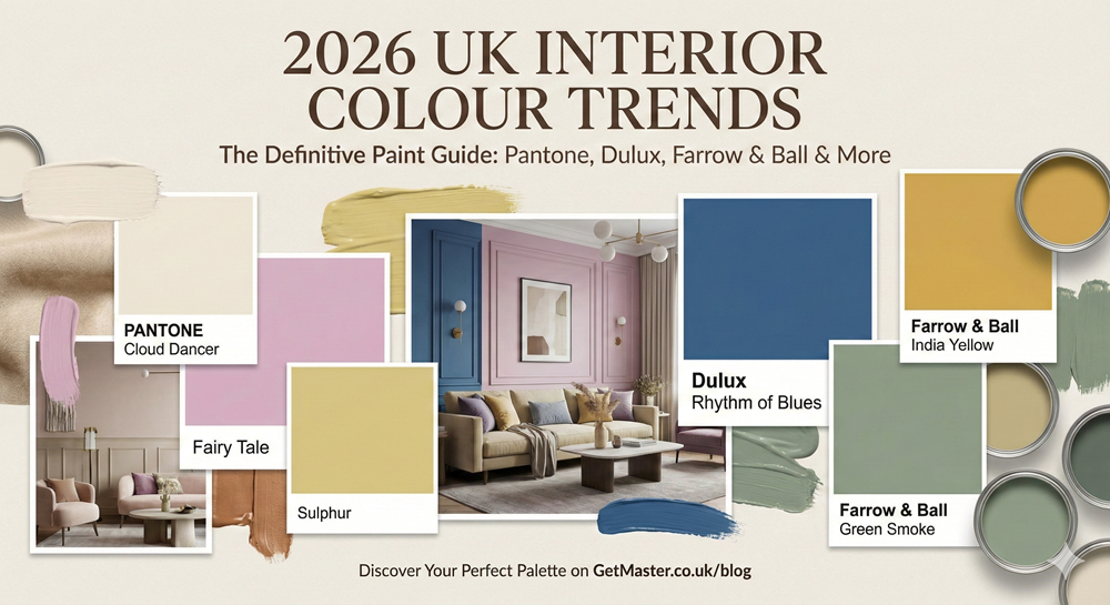
Every Major Brand's Colour of the Year, Analysed
Each year, the UK's leading paint brands announce their Colour of the Year (COTY) — a selection that reflects not just what they expect homeowners to buy, but the broader cultural and emotional moment they believe we're living through. Here is every major brand's 2026 pick, alongside an honest assessment of each.
Pantone: Cloud Dancer (11-4201)
Pantone's choice is the most discussed and most debated announcement of 2026. Cloud Dancer is a soft, billowy off-white — a "true neutral" with balanced warm and cool undertones that the Pantone Colour Institute describes as "a whisper of serenity in a noisy world." It is the first time Pantone has selected a white shade since 1999, and the reaction has been divided: some call it a masterclass in restraint, others have dubbed it underwhelming for a year that arguably demands bolder creative statements.
For UK interiors, Cloud Dancer is genuinely useful as a base. Unlike stark brilliant white — which can feel cold and clinical under the diffuse grey light typical of British rooms — this shade has enough warmth to feel welcoming without veering yellow. Interior designer Clair Strong describes it as "the perfect whole-home base colour," particularly effective in open-plan living areas and hallways. Pair it with textured finishes — stone floors, timber panelling, woven fabrics — to prevent it from feeling too sparse.
Dulux: Rhythm of Blues — Free Groove, Mellow Flow & Slow Swing
Dulux took a different approach in 2026, selecting not one shade but a family of three under the title Rhythm of Blues. The trio spans a vibrant cobalt (Free Groove), a softer mid-blue with grey undertones (Mellow Flow), and a stormy grey-blue (Slow Swing). The brand frames blue as both the world's most universally popular colour and a psychological tool: calm, fluid, and stabilising in a turbulent time.
Interior designer and colour specialist Melanie Lissack offers a considered view: while she supports the broader return of blue and the pairing of blue with rich chocolatey browns as one of 2026's definitive colour combinations, she finds Dulux's specific shades imperfect. Free Groove is a challenging statement colour for most rooms; Mellow Flow's grey content limits its warmth; Slow Swing's stormy character works best in a very specific setting. The broader trend of atmospheric, soulful blue is well-evidenced — the execution here requires care. Look to Farrow & Ball's Light Blue or Parma Gray for more nuanced alternatives from the same colour family.
Benjamin Moore: Silhouette (AF-655)
Benjamin Moore, distributed in the UK by Benjamin Moore UK Ltd, chose Silhouette — a rich espresso-brown shade with refined charcoal undertones — as its 2026 Colour of the Year. The brand frames it as "an elegant colour that weaves rich espresso hues with refined notes of charcoal," positioned at the centre of a broader palette of enchanting pales and handsome midtones. This reflects the broader chocolate-brown and deep-neutral trend that UK search data so strongly confirms: consumers are moving beyond coffee tones into richer, darker brown territory that occupies a space between a true neutral and a statement colour.
Graham & Brown: Divine Damson
Graham & Brown's Divine Damson is a deep plum-brown — a grounded, earthy take on jewel-tone that the brand describes as a shade "that commands attention." Despite its dramatic name, it reads in practice as a warm, sophisticated dark neutral rather than an overtly theatrical colour. It is particularly effective in small, low-natural-light spaces such as bathrooms and downstairs toilets — rooms where a white or pale shade can feel stark and clinical. Melanie Lissack notes that it works beautifully on kitchen cabinets, especially in kitchens with open shelving where bold colour sits below eye level.
Little Greene: Adventurer & Sunset Tones
Little Greene does not release a formal Colour of the Year, but creative director Ruth Mottershead has confirmed that the brand's focus for 2026 is a range of sunset-inspired tones centred on Adventurer — a deep plum-aubergine — alongside warmer shades including Ashes of Roses and Nether Red. These are not bright or saturated pinks and reds; they are muted, dusty, and grown-up, designed to add warmth and glow particularly in north-facing rooms. Little Greene's Adventurer has drawn comparisons to Graham & Brown's Divine Damson — different in undertone but occupying similar emotional territory: heritage, depth, and a sense of considered luxury.
Lick: Return to Play Palette
London-based paint brand Lick chose a curated Colour Edit rather than a single shade, titled Return to Play. The eight-colour palette spans a deep red, warm taupe, mossy green, soft blue, and a subtle butter yellow — positioned as "nostalgic primary colours reimagined with a grown-up feel." Lick's Taupe 03 is particularly well-regarded by designers as a backdrop colour, described as the ideal neutral for earthy greens and soft ochres. The overall palette is one of 2026's most coherent and commercially accessible for UK homeowners looking for a starting point rather than a single prescriptive colour.
Valspar: Warm Eucalyptus
Valspar's Colour of the Year, Warm Eucalyptus, sits within the broader green trend but takes a lighter, more airy position than the deep mossier greens seen elsewhere. It reflects the continuing appetite for green as a neutral — a versatile, grounding shade that feels both contemporary and timeless in British homes.
Global trend forecasting authority WGSN and colour system Coloro named Transformative Teal — a blue-green that blends dark blue and aquatic green — as their 2026 Colour of the Year. The choice reflects an Earth-first design mindset and growing consumer interest in blue and green tones, backed by a reported 9% year-on-year rise in teal-related searches. While more commercially challenging than a single paint brand's recommendation, it underpins the broader case for atmospheric blue-greens as one of 2026's most significant colour directions.
The 7 Key Colour Families for 2026
Stripping back the individual brand announcements and looking at the totality of research, seven distinct colour directions emerge for UK interiors in 2026. These are not equally dominant — the earthy-neutral story and the blue story are far bigger in terms of consumer search data than, say, dusty rose — but each represents a coherent direction that will be visible across UK homes throughout the year.
What's In and What's Out in 2026
Based on the convergence of brand COTY announcements, UK search data, and expert opinion, here is a direct analysis of the colours gaining and losing ground in British interiors in 2026. These are not absolute rules — good design is never simply about following trends — but they reflect the genuine direction of consumer taste and designer preference.
The single most important shift in 2026 is the move away from cool, flat colours towards warm, complex ones. Whether you're choosing a neutral or a statement, the test for 2026 is: does this colour have warmth and depth? Cool, flat grey fails this test. Warm terracotta, earthy green, indigo blue, and chocolate brown all pass it. The era of the cold, clinical neutral is over.
Need a Professional Decorator in the UK?
Don't risk an expensive colour mistake. Get matched with vetted, local painters and decorators to bring your 2026 vision to life.
Get Free Decorator Quotes →Room-by-Room Colour Guide for 2026
Different rooms call for different colour strategies. Here is a practical breakdown of what works where, based on the 2026 trends and UK expert guidance.
| Room | 2026 Direction | Recommended Shades | Pairs Well With |
|---|---|---|---|
| Living Room | Warm, enveloping. Colour drenching gaining traction. | Terracotta, deep indigo, warm taupe, sage green | Natural wood, linen, rattan, warm brass |
| Kitchen | Earthy cabinet colours replacing navy. Warm off-white on walls. | Warm clay units, sage green, deep plum, olive | Unlacquered brass hardware, oak, stone worktops |
| Bedroom | 'Sensory refuge' — cocooning, calming, deeply personal. | Deep plum, aubergine, dusty rose, warm indigo | Linen bedding, layered textures, low warm lighting |
| Bathroom | Moving away from all-white. Small rooms suit bold colour. | Divine Damson, deep teal, warm terracotta, mossy green | Aged brass, textured tile, natural stone |
| Hallway | First impression matters. Deeper, more dramatic than ever. | Rich espresso brown, deep indigo, moody green | Natural stone floor, statement light fitting |
| Home Office | Productive but calming. Biophilic tones dominate. | Sage green, warm eucalyptus, warm white, soft blue | Natural wood desk, plants, warm desk lamp |
| Children's Room | Lick's Return to Play: primary colours, grown-up and joyful. | Soft terracotta, warm yellow, earthy red, muted blue | Natural wood furniture, woven storage, simple lighting |
— Clair Strong, interior designer
Choosing Colour for UK Light Conditions
This is where UK homeowners have an advantage over international trend guides that don't account for our specific light conditions. Britain receives significantly less sunlight than most of continental Europe, and the quality of that light — cooler, more diffuse, often grey — has a profound effect on how paint colours read in real rooms.
North-Facing Rooms
North-facing rooms receive no direct sunlight and can feel perpetually cold. In these spaces, the worst choices are cool greys and stark whites, which will look flat and clinical. The 2026 trends actually work in your favour here: warm terracotta, buttery yellow (Farrow & Ball's Hay), dusty rose, and warm off-white (Cloud Dancer) are all genuinely warming in cool-lit rooms. Deep, rich colours — a plum, a dark green, an indigo — can also work beautifully in north-facing rooms by leaning into the atmosphere rather than fighting it. Little Greene's muted sunset tones are specifically praised by designers for north-facing applications.
South-Facing Rooms
South-facing rooms receive warm, raking afternoon light that can make warm-toned colours feel very intense. In a south-facing living room, a terracotta that reads beautifully in a north-facing space might feel overwhelming in high summer. Cooler tones — atmospheric blues, muted greens, warm off-whites — tend to work better here. Dulux's Mellow Flow or a Farrow & Ball green like Mizzle are well-suited to sunny south-facing rooms.
East and West-Facing Rooms
East-facing rooms receive cooler morning light and are warmer in the afternoon; west-facing rooms are the reverse. Both present moderate challenges. Most of the 2026 colour families work in east and west-facing rooms, but always test paint in situ at different times of day before committing. The quality of light in a room at 8am and 6pm can be remarkably different, and what looks warm and welcoming in one can look completely different in the other.
This is the most important practical advice in this entire guide. A paint swatch on a card in a shop bears almost no resemblance to how that colour will look painted on your wall. Always buy a tester pot (most UK paint brands offer large tester pots for £5–£10) and paint at least an A3-sized area directly on the wall. Observe it across a full day, in artificial light in the evening, and next to the furniture and flooring that will actually be in the room. This single step prevents the majority of expensive colour mistakes.
How to Use 2026 Colours Without Repainting Everything
The good news about 2026's colour direction is that the trend cycle has slowed. Sharps' research explicitly identifies the "Timeless Index" — the degree to which a trend shows sustained, consistent interest rather than a sharp spike-and-fall — as a key measure of whether a colour direction is worth acting on. Earthy tones score exceptionally highly on this measure. These are not colours you'll be embarrassed by in three years.
The Sixth Wall: Paint Your Floor
One of 2026's most distinctive emerging trends — confirmed by Little Greene creative director Ruth Mottershead — is painting floors as part of a whole-room colour scheme. After years in which the ceiling was the "fifth wall" of a colour drench, designers are now turning attention to the floor as the sixth. If you have wooden floorboards or concrete, floor paint in a complementary tone (or the same shade as your walls) creates an immersive, fully resolved room. Use a durable floor-grade paint; Farrow & Ball's Flat Eggshell range is formulated for this purpose.
Colour on Joinery, Not Just Walls
If full-wall colour feels like too large a commitment, applying colour to joinery — skirting boards, door frames, window frames, and internal doors — is one of the most effective and reversible ways to introduce the 2026 palette. Painting these elements in a deep terracotta, indigo, or earthy green while keeping walls neutral creates exactly the kind of layered, characterful scheme that defines the current moment in UK interiors.
Soft Furnishings and Textiles
Cushions, throws, curtains, and rugs are the lowest-commitment way to test 2026 colours before committing to paint. A single terracotta linen cushion or a mossy-green velvet throw can tell you within days whether you're genuinely drawn to a colour or just attracted to it on screen. The difference is important: colour you live with happily is different from colour you admire in a magazine.
Single Statement Walls and Alcoves
For those wanting to introduce the bolder 2026 colours — deep plum, rich indigo, espresso brown — without committing an entire room, the alcove or single chimney-breast wall remains a low-risk, high-impact approach. Victorian and Edwardian UK homes are particularly well-suited to this technique: the alcoves on either side of a chimney breast take a deep, rich colour beautifully, anchoring the room without overwhelming it.
Frequently Asked Questions
Ready to Transform Your Walls?
GetMaster connects you with verified, experienced decorators and painters across Glasgow and the UK — free quotes, no obligation, fully vetted tradespeople with real reviews.
Rated 4.9/5 · ID-Verified Professionals · No commitment required